Sensory research
Lifestyle, FMCG, vape and sensory e-commerce patterns, audience needs and decision friction.
01 / ELF BAR
MAKING FLAVOR FEEL VISIBLE
BEFORE THE FIRST TASTE.
A visual-first UX concept exploring how sensory cues, focused hierarchy and progressive discovery can make online flavor selection easier for adult users.
 DK / ELF BAR
02Overview
This Elf Bar concept explores how sensory cues and focused hierarchy can make online flavor selection feel more intuitive. I developed the UX direction, structure, exploration flow, wireframes, interaction logic and high-fidelity desktop interface.
Lifestyle, FMCG, vape and sensory e-commerce patterns, audience needs and decision friction.
Homepage architecture, flavor hierarchy and a progressive path through the assortment.
Wireframes and prototypes balancing product, flavor imagery, supporting copy and CTA placement.
Flavor-led color, large typography, visual anchors, accessible contrast and consistent components.
UX concept · Sensory e-commerce research · Information architecture · Flavor exploration flow · Wireframes · Interaction logic · Desktop UI · Visual hierarchy
03The challenge
FLAVOR IS SENSORY. MOST INTERFACES DESCRIBE IT LIKE A SPECIFICATION.
Flavor-based products are difficult to choose without physical interaction. Text-only descriptions, large equally weighted assortments and uniform layouts make taste hard to imagine and comparison unnecessarily demanding.
Simplify decision-making and strengthen flavor perception through a visual-first experience that gives one option clear priority, preserves access to alternatives and keeps supporting information concise.
04Research
I analysed lifestyle, FMCG, vape and sensory e-commerce experiences, focusing on adult users aged 18–30, first-time or occasional buyers who value speed, aesthetics and clarity over technical detail.
 DK / ELF BAR
Flavor names and descriptions ask users to imagine too much. Color, imagery and product presentation can communicate the sensory cue faster.
Large assortments become difficult to compare when every option competes with the same visual weight and amount of information.
Adult users aged 18–30 valued speed, aesthetics and clarity over technical detail, especially when they did not already know which flavor to explore.
Lifestyle brands · FMCG · Vape experiences · Sensory e-commerce · Visual hierarchy · Flavor exploration
05Process
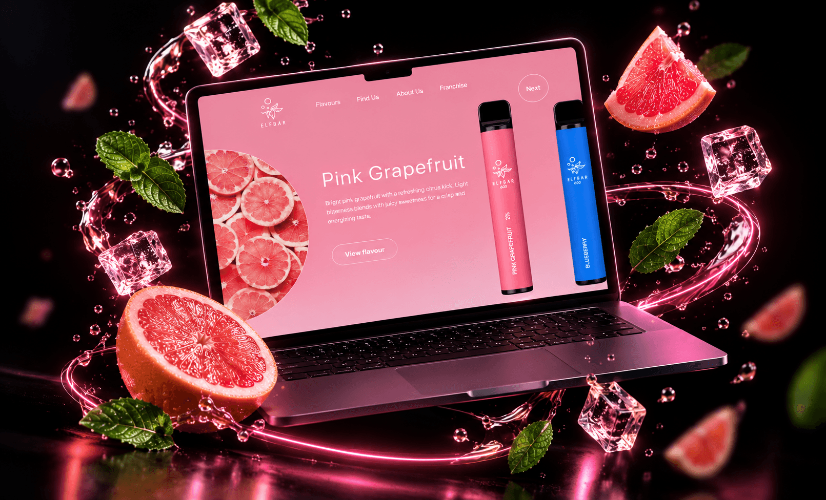
The homepage follows one deliberate sequence: hero, flavor name, sensory cue, short description and CTA. One primary flavor leads, while secondary options stay visible but de-emphasized for progressive exploration.
I mapped the order in which the user sees product, flavor cue, supporting copy and the next action.
Low-fidelity layouts compared different balances between flavor imagery, product scale and controls.
High-fidelity prototypes strengthened the primary visual anchor and reduced unnecessary copy.
Contrast, typography and soft background elements were adjusted to keep the experience accessible.
Color, fruit imagery and product visuals establish the expected taste before supporting text appears.
A single dominant option reduces cognitive load and makes the starting point immediately understandable.
Text confirms the visual cue rather than trying to replace the sensory experience with explanation.
Secondary flavors remain discoverable with reduced emphasis, encouraging exploration without pressure.
06Product solution
The concept turns flavor into a visual sequence rather than a list of specifications. Product, color, imagery and short copy work together to guide attention without overwhelming first-time or occasional buyers.
01 / FLAVOR HERO
The hero creates an immediate sensory cue through flavor-specific color, imagery and product scale, then confirms it with a short description.
 DK / ELF BAR
02 / PRODUCT FOCUS
A central product visual reinforces brand recognition and connects the physical object with the mood and identity of each flavor.
 DK / ELF BAR
03 / NAVIGATION
Minimal navigation protects the primary visual flow and keeps the user focused on discovering flavors rather than managing the interface.
 DK / ELF BAR
07Outcome
The concept demonstrates how visual hierarchy and sensory cues can turn flavor selection from a rational comparison task into a more intuitive emotional experience. Faster understanding and easier decisions remain design hypotheses to validate, not measured product outcomes.
Usability testing with first-time adult users
Mobile adaptation of the exploration flow
A/B testing of flavor presentation strategies