Research
Competitor and medical website analysis, surveys, interviews, personas and journey mapping.
01 / SMILECARE
MAKING DENTAL CARE EASY TO TRUST,
SIMPLE TO BOOK.
A conversion-focused dental clinic website that helps patients of different ages understand services, trust the medical team and book an appointment without friction.
 DK / SMILECARE
02Overview
SmileCare is a modern dental clinic website designed to help patients understand services, trust the team and book an appointment in two to three steps. I owned the process from research and information architecture to testing, desktop UI and the component library.
Competitor and medical website analysis, surveys, interviews, personas and journey mapping.
Content hierarchy, navigation, user scenarios and the end-to-end appointment flow.
Low-fidelity wireframes, interactive prototypes and usability testing across age groups.
Final desktop screens, accessible visual language, UI kit and reusable components.
Competitor analysis · Information architecture · User flows and scenarios · Wireframes · Interactive prototypes · Desktop UI · UI kit and components
03The challenge
CHOOSING A CLINIC IS ALREADY STRESSFUL. THE WEBSITE SHOULD NOT ADD FRICTION.
Many competitor websites were outdated, cluttered and difficult to navigate. The experience had to remove booking friction and prove the clinic's credibility while remaining simple for both mobile-first patients and older users.
Combine professional medical credibility with a friendly, lightweight interface and a clear two-to-three-step booking flow that supports conversion without sacrificing accessibility.
04Research
I analysed dental clinic and medical service websites, collected feedback through surveys and interviews, created personas for younger and older patients, and mapped their journeys to identify trust gaps and booking friction.
 DK / SMILECARE
Overloaded pages and confusing forms interrupted intent. Patients needed a short, visible route from first visit to confirmation.
Doctor qualifications, authentic photography, reviews and ratings helped patients feel more confident about choosing a clinic.
Young mobile-first users expected speed, while older patients needed readable labels, simple navigation and predictable interactions.
Dental clinic websites · Medical services · Booking patterns · Trust signals · Accessibility · Patient journeys
05Process
I translated research into a five-item content structure and a booking journey that could be completed in two to three steps. Wireframes and prototypes helped test the complete path before final visual design.
 DK / SMILECARE
 DK / SMILECARE
Services, Doctors, Prices, Reviews and Contacts became the foundation of a predictable navigation.
The flow focused on name, phone, date and doctor selection, with no unnecessary form fields.
An interactive Figma prototype connected discovery, doctor selection, booking and confirmation.
Multiple testing rounds and prototype analytics revealed friction and guided iterative improvements.
A fixed, predictable menu keeps services, doctors, prices, reviews and contacts one step away.
Booking actions appear in the hero, service area, doctor cards and at the end of the page.
Short service cards keep the homepage scannable, while full descriptions live on dedicated pages.
Real doctor photography, specialisations, reviews and ratings support confident decision-making.
06Product solution
The interface combines a clear booking path with visible proof of expertise. Patients can understand the offer, choose a doctor and act without navigating through dense medical content.
01 / HERO + CTA
A focused message and primary booking action explain the clinic's value immediately and give high-intent visitors a direct next step.
 DK / SMILECARE
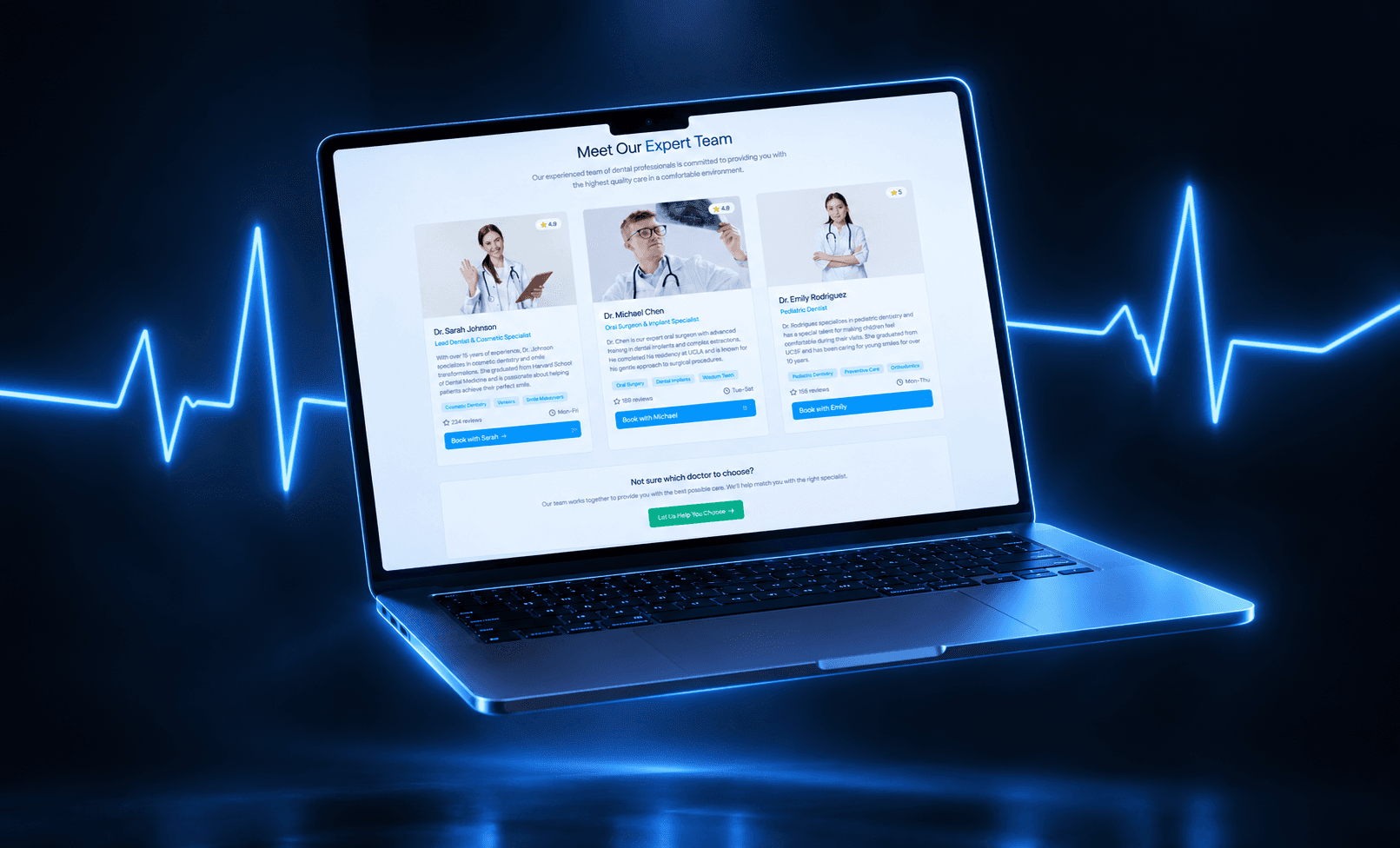
02 / DOCTORS
Doctor cards combine authentic photography, specialisation and a direct booking action, reducing uncertainty and conversion distance.
 DK / SMILECARE
03 / BOOKING
The appointment flow asks only for essential information and stays accessible from every high-intent section of the website.
 DK / SMILECARE
07Outcome
Increase in booking conversion
Increase in new patient inquiries
Increase in average session duration
The website became a practical growth tool: patients gained a faster way to find a doctor and book, while the clinic strengthened its digital credibility, increased inquiries and improved engagement through a clearer content structure.