Market research
Comparative analysis across local bakeries and large confectionery chains, audiences and CJM.
01 / SWEET DELIGHTS
TURNING HOMEMADE WARMTH INTO A BRAND
PEOPLE WANT TO EXPLORE.
A confectionery website that makes the brand feel distinctive, helps customers browse the assortment and turns product interest into a confident online order.
 DK / SWEET DELIGHTS
02Overview
Sweet Delights is a modern confectionery website that turns the brand's warmth, craftsmanship and product quality into an intuitive shopping experience. I owned the process from competitor research and architecture to testing, desktop UI and the component library.
Comparative analysis across local bakeries and large confectionery chains, audiences and CJM.
Information architecture, catalog navigation, product discovery and online ordering flows.
Wireframes, interactive desktop and mobile flows, client feedback and testing with 10 participants.
Final desktop screens, visual identity, product imagery, UI kit, components and hover behaviour.
Competitor analysis · Information architecture · Online ordering flows · Wireframes · Interactive prototypes · Desktop UI · UI kit and components
03The challenge
THE SWEETS HAD A PERSONALITY. THE WEBSITE DID NOT.
Sweet Delights relied heavily on social media and word of mouth. The old website did not express the brand's warmth or product quality, while a confusing assortment and cumbersome ordering path limited online engagement.
Create a modern digital storefront that communicates joy, coziness and craftsmanship, makes products easy to compare and reduces the distance between discovery and purchase to one or two clicks.
04Research
I compared local bakeries with large confectionery chains, defined two audience groups, mapped the customer journey and tested the solution with 10 participants—five young adults and five family clients.
 DK / SWEET DELIGHTS
Difficult search and overloaded assortments made browsing feel like work. Clear categories and compact cards helped products stay comparable.
Younger customers valued aesthetics and effortless ordering. Appetising imagery and a cohesive visual language made the assortment feel more desirable.
Quality, transparency and ease of choice mattered to family clients. Brand story, reviews and clear contact details supported confidence.
Local bakeries · Confectionery chains · Catalog patterns · Ordering flows · Brand storytelling · Quick contact
05Process
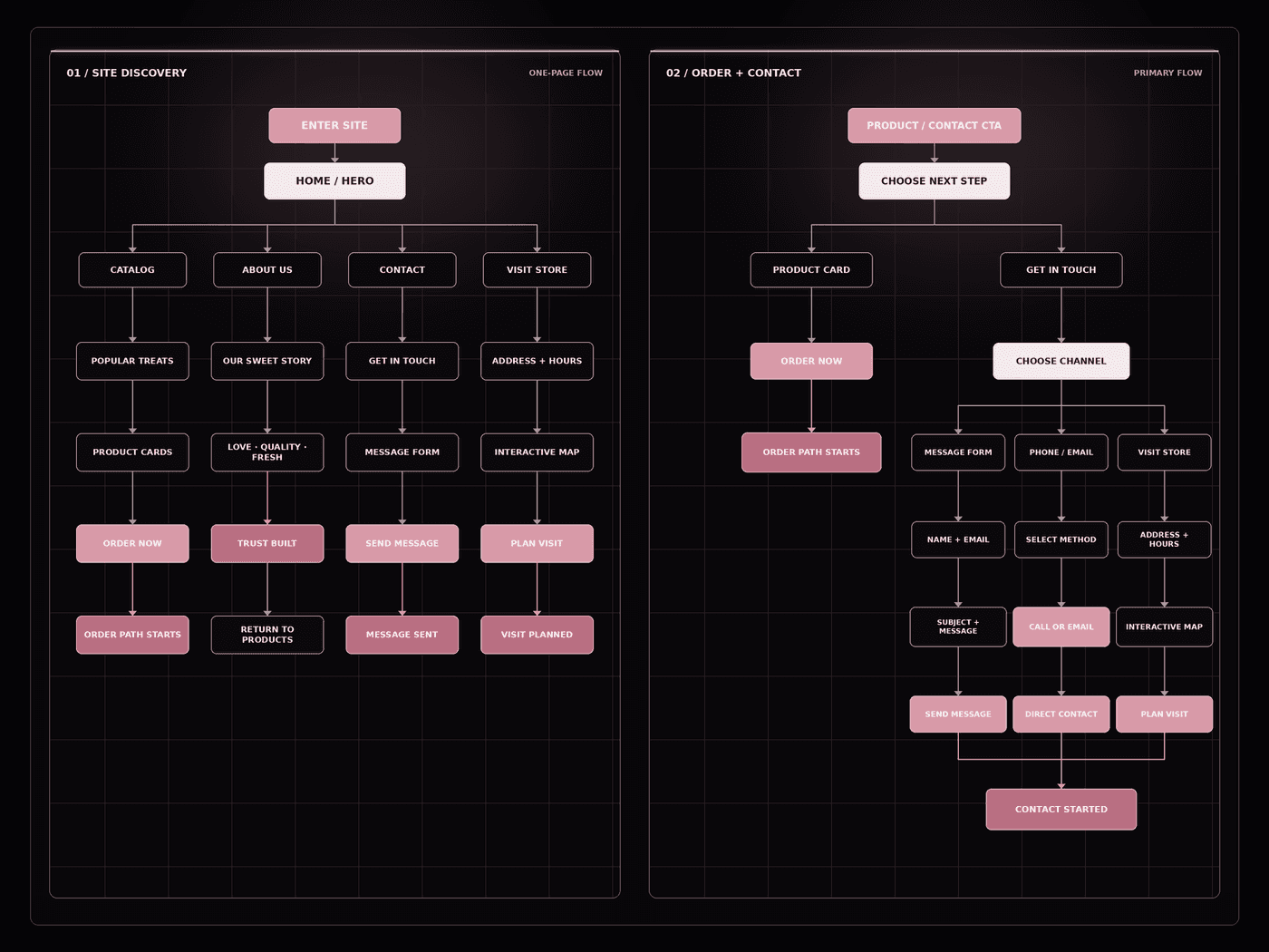
I structured the website around Home, Catalog, About Us and Contacts, then designed product cards and CTAs to shorten the route to purchase. Wireframes and prototypes tested navigation, card layout and ordering behaviour.
 DK / SWEET DELIGHTS
 DK / SWEET DELIGHTS
Home, Catalog, About Us and Contacts created a simple structure with no competing menu layers.
Each card combines product photography, a concise description, price and a direct ordering action.
Desktop and mobile flows compared multiple locations for banners, product cards and purchase actions.
Five young adults and five family clients helped refine forms, CTA size, readability and card layout.
Image, description, price and “Order Now” stay together so users do not lose purchase context.
Banners, highlighted products and catalog cards offer a clear next step without becoming intrusive.
“Our Sweet Story,” customer reviews and quality assurances connect craftsmanship with social proof.
Essential form fields and visible progress keep the checkout understandable from action to completion.
06Product solution
The solution pairs an appetising, recognisable visual identity with lightweight commerce mechanics. Visitors can discover products, understand quality and order without navigating an overloaded catalog.
01 / HERO + CTA
An engaging banner combines the brand mood, product imagery and a direct path to the catalog or physical store from the first screen.
 DK / SWEET DELIGHTS
02 / CATALOG
Each card combines an appetising photo, concise description, price and “Order Now” action so customers can compare and decide in context.
 DK / SWEET DELIGHTS
03 / BRAND STORY
The “Our Sweet Story” section introduces the people and values behind the bakery. Warm imagery, a personal narrative and clear quality highlights give visitors a reason to connect with the brand beyond its products.
 DK / SWEET DELIGHTS
07Outcome
Increase in online order conversion
Increase in new customers
Increase in average session duration
The redesigned website became a practical growth channel: customers could browse and order more confidently, while Sweet Delights strengthened its digital identity, communicated product quality and increased online sales and engagement.